Glass House Aqua
This is a personal concept brand identity for a boutique that sells high end aquarium products.

Final logo

Sketch ideation — The idea was to use an aquarium tank to represent a home for the fish and integrate a G.

Vector iterations — The evolution of the home/G motif from a house to an aquarium viewed from a top corner angle. The fish was inspired by the espei rasbora, with its characteristic black line running down its body.

Logo usage on different colored backgrounds

Brand colors and typeface. The teal colors are similar to the color of the glass edges in rimless low iron aquarium tanks.

Business Card

The tank and cabinet were created in Illustrator while the aquascape was generated by AI. The logo is etched onto the glass and contrasts with the substrate layer.
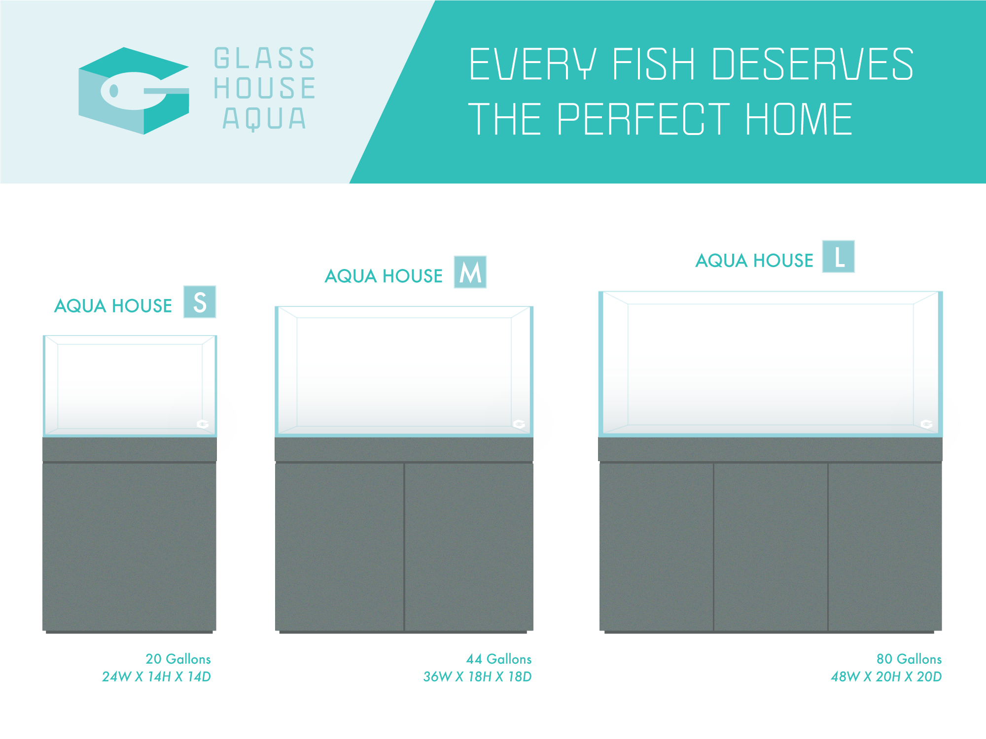
Rimless tanks and cabinets offered in the most popular sizes.
Icebox
I created the brand identity for a dessert shop specializing in macaron & cookie ice cream sandwiches. Marketing collateral includes business cards, banners, flyers, store menus, cups, and bowls.
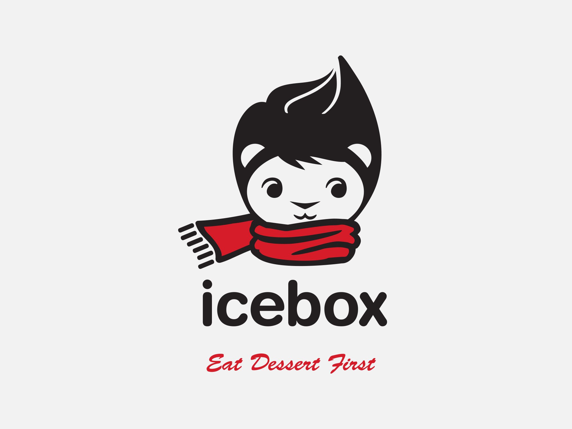
Final logo. Red was requested as the primary color.

Ideation – Client wanted her favorite animal, a lion, incorporated into the logo. During brainstorming, we had the idea to make the hairstyle resemble the swirl on the tip of an ice cream.

Logo Ideas – Hair and scarf options. We opted for the simpler scarf for more legibility at smaller sizes and the original ice cream swirl for the hair.

Final logo — horizontal configuration
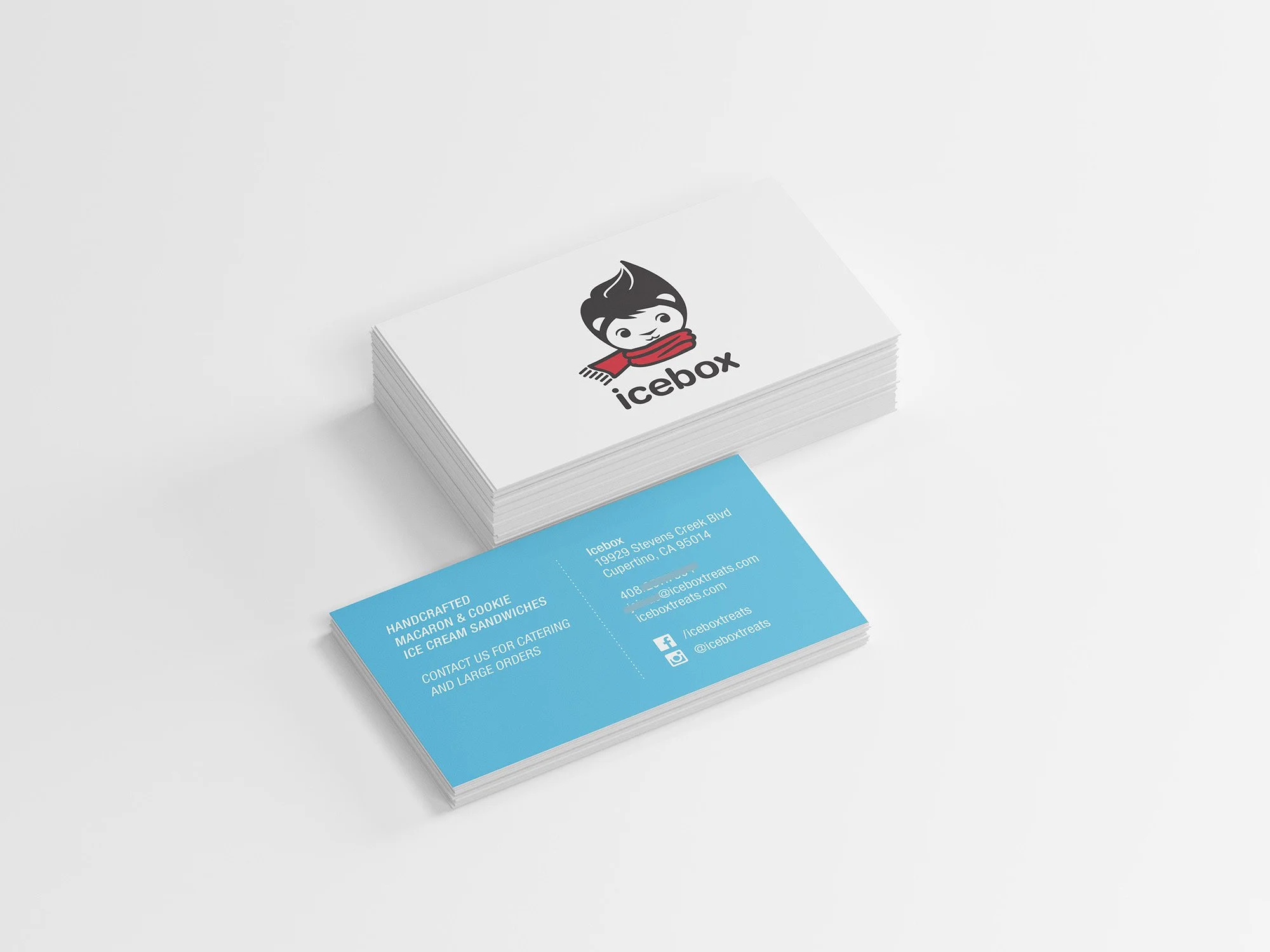
Business Cards
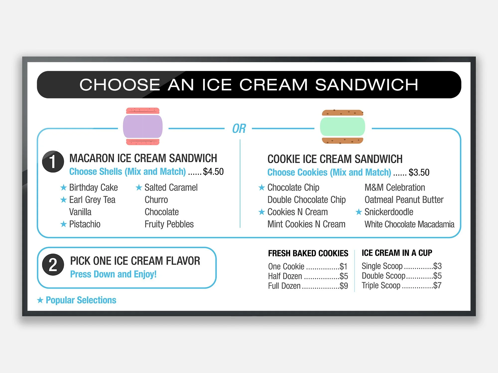
Ice Cream Sandwich Menu

Flyers